Summary
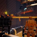
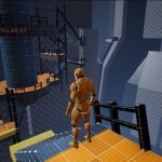
This level was created initially as a study of spatial composition and image composition that I decided to push beyond initial constraints with new ideas and iterations based on feedback I received from classmates.
Taking inspiration from a manga series I enjoy (Blame!), I tried to create a vast, maze-like, dark, decrepit structure that encouraged exploration with rewards and unlockable areas, but also had an intense atmosphere that kept Players on their toes while avoiding dangerous entities.
Project Details
– Created during my time in the Level Design for Games CGMA course
– Built in ~80 total hours over the course of 3 weeks
– Built with Unreal Engine 4
– Study of Image and Spatial Composition
– Study of Visual Language, Affordances and Landmarks
– Study of Identity and Purpose of Space(s)
– 3rd Person Open World Adventure gameplay
– Linear Level Blockout Exercise
– Blueprint Visual Scripting Exercise
Level Brief:
In The Megastructure, the player must traverse a gigantic, mechanical structure seemingly absent of human life in order to reach “The City”. While exploring the structure, players can find valuable loot and keys to utilize or sell as they overcome platforming challenges, bypass locked door to access optional areas, and avoid the dangerous cyborgs that haunt the many halls and chasms of The Megastructure.
GAMEPLAY OVERVIEW
Active Environment Traversal
To help keep Players engaged while navigating between areas, various obstacles can be encountered while exploring the Megastructure. This ensures Players are actively interacting with the environment (and their controller) by requiring they mantle over, crouch under or move around obstacles in order to progress.
Timed Platforming Challenges
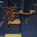
Short platforming segments need to be overcome in order to reach the City at the end of the level. These were included in order to add another movement-focused obstacle to challenge the Player.
I chose to have the platforms drop after a few seconds to add another layer of complexity to the challenge. The addition of a color-changing light above the platform is used to inform the Player when the platform will drop, providing a stronger visual cue to jump.
Rewarding Exploration
Some locations include side areas that the Player can explore if they choose. Doing so can often reward them with helpful loot, atmospheric views, and sometimes a Keycard. If the Player finds the Locked Door the Keycard is for, they can gain access to additional areas or rooms containing helpful resources.
Tense Stealth Encounters
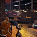
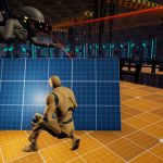
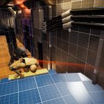
In order to reach a Keycard, Players will need to utilize their moveset to sneak past the Megastructure’s security measures – a patrolling cyborg. This enemy patrols the Cryostasis Lab on a set path along a track (visualized with the yellow/black checkerboard) and can capture the Player if caught in their vision cone.
Objects are placed along the cyborg’s path to give the Player safer spaces to move between as they sneak past the cyborg and move through the Lab.
Surprise Chase Sequence
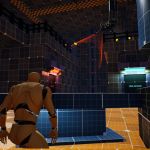
After the Player is done in the Lab section of the level, a chase sequence was added as a high-octane ending moment with the cyborg enemies. This was done to signal to the Player that they wouldn’t have to worry about encountering this enemy anymore.
I chose to set the chase sequence in the same hallway the Player enters the Lab area from in order to surprise (and eliminate some back-tracking monotony) the Player as they’re returning to the main path.
Interactive Environment
Interactive elements such as vents, loot, ladders, buttons, squeeze-through spaces, and collectibles are present to make the level feel more alive and help the Player feel like their actions have impact.
Level Walkthrough Video
PRE-PRODUCTION
Map Overview
I wanted to create a space that the Player would constantly revisit as they explored and progressed through the level. This would help me show the Player their progress through the level regardless of their point of entry, as well as save some time and resources by being able to reuse the same space in different ways.
Beat Graph
Thematically, I pictured this as a Sci-Fi/Horror experience where the Player would have to traverse a dangerous area of the Megastructure in order to reach the safety of the City in the distance. I created a Beat Chart to help me visually plan when and where the tense moments I wanted the Player to experience occurred.
Restrictions and Goals
My goal was to create an interesting space to traverse that could push and pull the Player from start to end without them getting lost or turned around. Additionally, I wanted to incorporate large vistas so the Player could easily mentally map the space and view their progress towards the goal as they advanced.
Defining the Setting
I was initially prompted with the word “canyon”, but wanted to diverge from the usual rocky/mountainous setting and felt a man-made canyon would be more interesting to explore. Taking inspiration from a manga series I enjoy (Blame!), I imagined a vast, maze-like, dark, decrepit structure as I built out each space, ensuring each area had an obvious purpose and could easily be identified.
Reference Gathering
I started by collecting images from this striking manga series called “Blame!” and continued to bring in some more Sci-Fi structures that included vast spaces, taking note of how the spaces were arranged to lead the eye to a focal point. These references helped me compose my establishing shot to hint at future paths and spaces the Player could explore.
Defining Metrics
Crouch height was a metric I wanted to define so that I could include interesting obstacles like fallen over pipes or crouch-through structures, as well as floor vents the Player could hide in during stealth sequences.
Jump distance was used to ensure platforming sequences were spaced correctly so the jump felt fair and fun. Additionally, I used the same width for the hallways and pathways so that I knew the Player had enough space to move in and the camera wouldn’t be bouncing off of walls and other objects throughout gameplay.
LEVEL BLOCKOUT
Establishing Shot
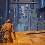
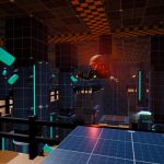
Using the principles of image composition (ex. rule of thirds), I tried to create an enticing spatial composition with shapes that was used as an establishing shot for the level. The City Structure in the distance was my intended focal point, hinting to the Player that it was their destination/end of the level.
Canyon
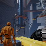
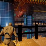
The “Canyon” was the core area of the level that the Player would constantly revisit from different entry points/viewing angles. To ensure the Player knew where to go at a glance, I used objects to frame navigable pathways and doors so they were easily visible when viewing the area from any of the possible entry points.
Power Routing Tunnel
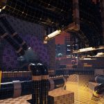
This area serves as the first explorable space. To help direct the Player towards the exit and ensure they didn’t get turned around while exploring, I placed a large collection of “wires” that started from one end of the room and ended at the exit. With the additional use of lighting and framing, Players are able to follow these shapes with their eye and naturally be led to the exit door from almost any space within the area.
Cryostasis Lab
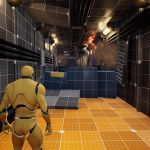
This area supports a different gameplay style than what the Player has experienced so far – stealth! To hint the change of pace to the Player, I made the hallways leading to this area feel claustrophobic to slow the Player down as they approached.
I built the actual Lab space around the path I wanted the security cyborg move along, with little alcoves and objects throughout for the Player to hide behind/in.
Bio Lab
This section of the Lab supported another cyborg (surprise!) the Player had to sneak past, as well as lead back to the room that contains the Keycard needed to progress.
Additionally, a short cutscene where the Player witnesses the cyborg attack another humanoid discovered in the lab plays after successfully sneaking past the cyborg to hint at the chase sequence the Player encounters as they leave the Labs.
Gallery
DESIGN TECHNIQUES
Image and Spatial Composition
I was able to utilize spatial composition techniques to compose interesting entry views that guided the Player towards the level’s goal. Focus elements placed at various distances throughout the space were used to pull in the Player while tight spaces that require crouching were used to push the Player forward.
Visual Language and Affordances
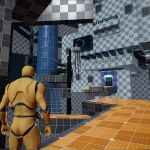
I established a color-coded visual language to quickly communicate the purpose of an object to the Player so they could know what objects were interactive and in what way at a glance.
Including objects such as wires connecting locked doors and the switch that unlocks them helped show the Player what they needed to do instead of telling them.
Purpose of Space
I wanted each area the Player encountered to have a sense of purpose and identity so they could mentally map the space easily. The use of important items, landmarks, and unique layouts helped create memorable spaces.
Guiding the Player
I was able to guide the Player to the objective of each space with the use of focal points/landmarks, enticing loot and shapes, spatial directive, and visual language (ex. doors that are obviously locked).
With continued use of these techniques, I could lead the Player through the level without the use of UI elements such as waypoint markers. I found this made the level more immersive as there were fewer distractions preventing the Player from taking in the space.
Player Agency
I was able to implement a sense of Player Agency with the introduction of collectibles and side areas. This allowed Players that like exploring to find various items and/or areas as a reward for being observant.
Additionally, the stealth sequences can be overcome in multiple ways. I found this let Players feel more empowered when faced with a challenge because they were able to choose their own plan of attack.
POST MORTEM
What went well?:
– I think I was able to create a relatively polished level blockout over the course of 3 weeks/80 hours that encourages some fun exploration-based gameplay within an atmospheric environment. I’m quite proud of this one :]
– I got to push myself to incorporate elements of interactivity throughout the level such as hiding spaces (vents), collectibles (loot, keys), ladders, squeeze-through spaces, buttons that caused various things to occur in the environment, and even a pretty intense (even if it is pretty short) chase sequence!
– I received tons of valuable feedback over 3 different iterations of this level! It was great to hear what others thought of my level and how I could improve. I learned a lot!
What went poorly?:
– Some places were a little lackluster or clunky. I think I was more focused on creating an expansive, cool-looking environment to explore that I lost valuable time I could’ve used to strengthen existing areas with more gameplay elements.
– The level turned out to be more linear than I was hoping for. I pictured the Canyon area being more of a hub that would let Players choose their path forward more freely, but I instead created a more linear level that had Players following along a mostly pre-set path.
– There area quite a few areas where I forgot to take the Player camera into account. This caused the vents Players could hide in to be quite cumbersome and almost less helpful because the camera would be positioned right next to the Player or clipping through geometry when inside a vent, making it quite difficult to see the enemies and determine a good time to exit.
What did I learn?:
– If I could start over and do something different, I’d probably reduce the scale of the level and focus on gameplay challenges before worrying about how easy to read a space is. There’s some long hallways that are at the verge of feeling too long and boring, and I ran out of space to make any significant platforming segments due to filling my spaces with props to lead the Player before thinking about gameplay. This improved over each iteration, but still something I wish I had taken into consideration more at the start.
– I learned a lot about how to use spatial composition, organization and node networks to naturally guide the Player through a space.
– I learned the value of having a clear and established visual language, especially in blockouts! I think I was able to get my ideas across much easier thanks to everyone playing my level being able to understand what an object of a specific color was for. For example, any object that could be traversed/mantled was colored Yellow, any interactive object that required a button press was colored Purple, walkable surfaces were Orange, doorways were Purple… You get the idea :] I think this helped me get better, more valuable feedback from my peers as the folks playing my level were less confused and were able to give feedback related to the experiences I tried to convey instead of wondering how something was supposed to function.


